
ECOHIVE Branding
Year
2020
Sector
Government Institution
“Identity, Iconic Characteristics, Balanced, Educational, and Encouraging.”
Ecohive is the name chosen for a hub that will house 4 new waste management plants with the goal of maximising the potential of Malta's waste, turning it into a resource, and giving it a new purpose. This includes recycling, the generation of electricity, and the production of compost.
We were approached with the task of creating an identity and subsequent campaigns for this project, with the aim of educating the public on this new initiative, as well as encouraging them to do their part in proper waste sorting.
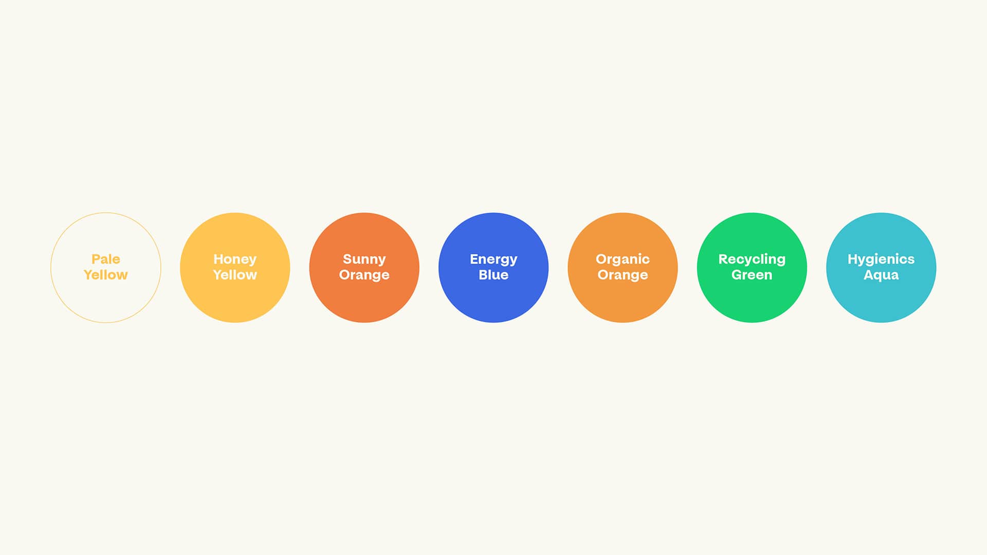
The muse behind this project was the bee. Bees pollinate, help plants breed, grow, and produce food whilst also producing nutritious honey. With this in mind, our team created Ecohive, which represents hard work and efficiency, an ever-moving hub that continues to find and implement solutions to the best of its abilities, and continuously seeks to improve. The Ecohive logo is made up of 2 main components: the icon, and the word marque. The icon depicts a bee, built from hexagons, reflecting the hexagonal shapes that are found in beehives. The word marque reflects the bold lines found in the icon with its own characteristics while grounding the logo and bringing balance to its overall composition.
")


")
")
")
")
")
")
")
")